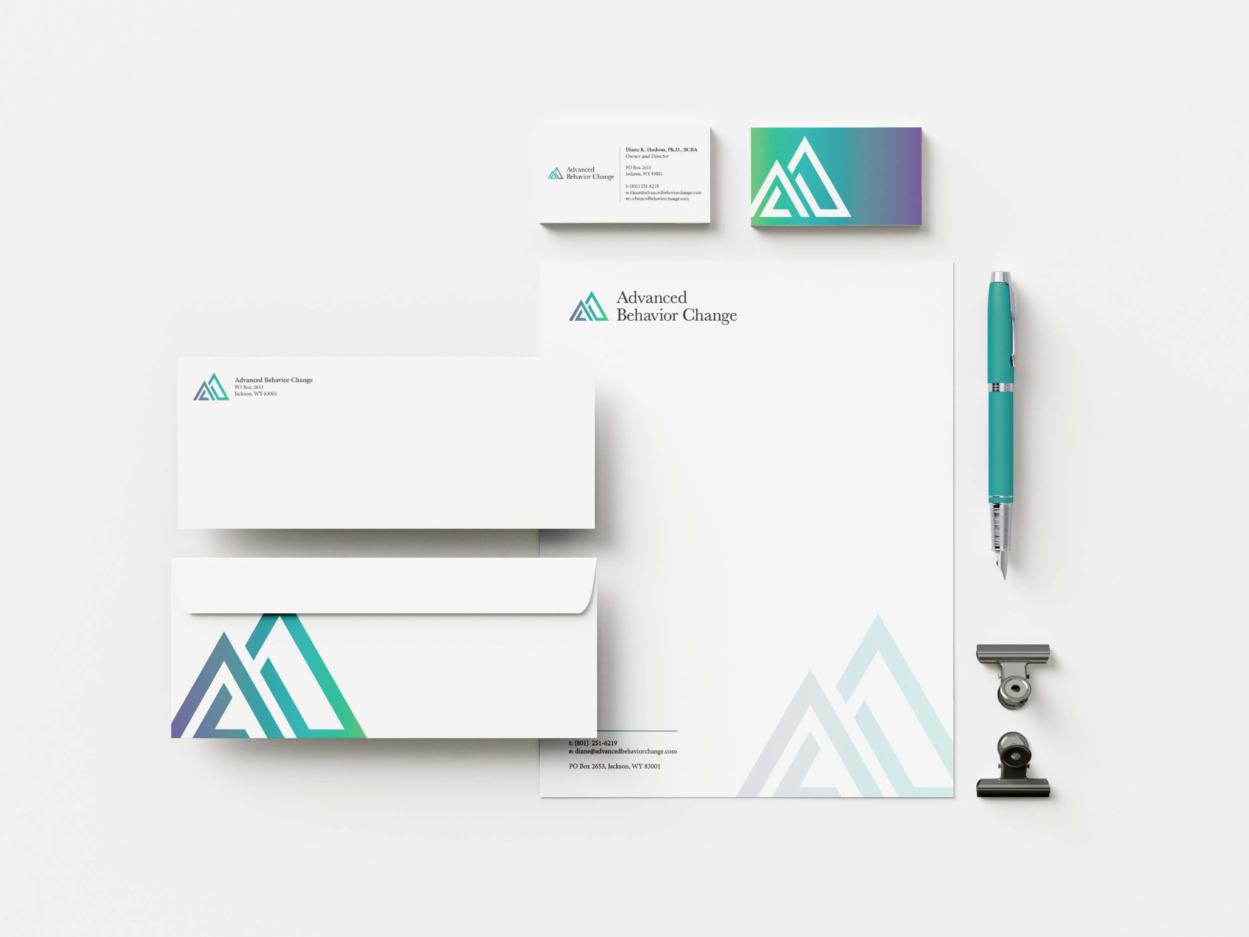
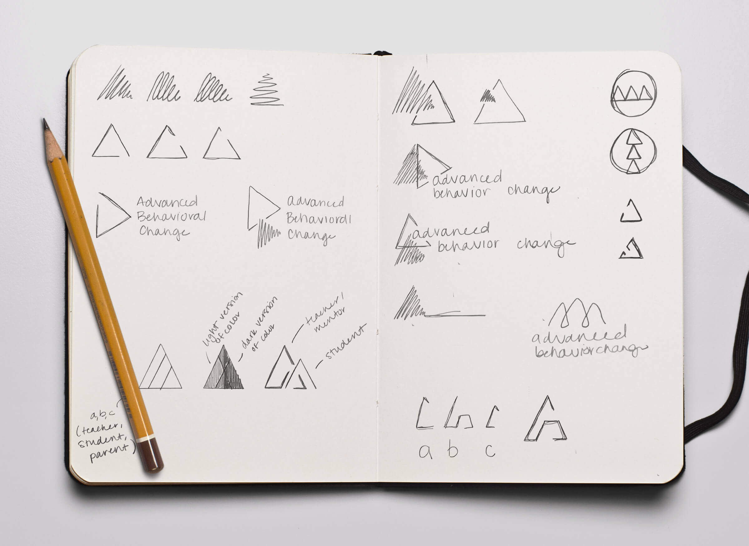
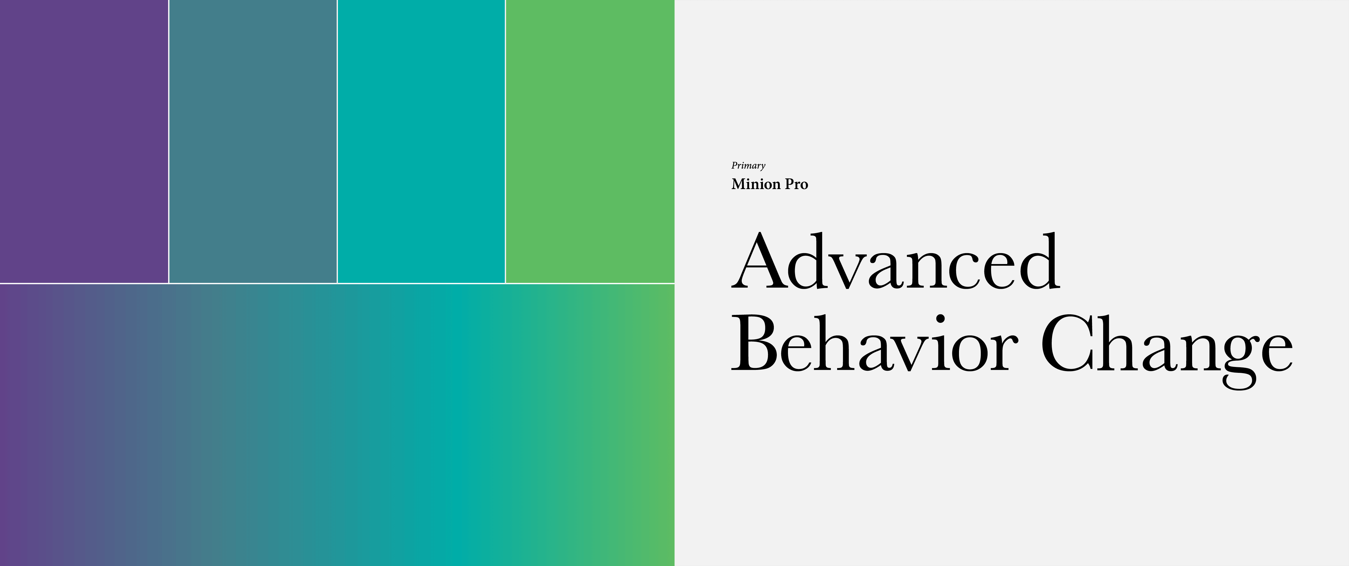
Dr. Hudson’s brand identity needed to represent her personal and professional interests. She wanted a logo that incorporated mountains and the colors blue and green while looking approachable. The result is a brand identity that is uniquely hers.
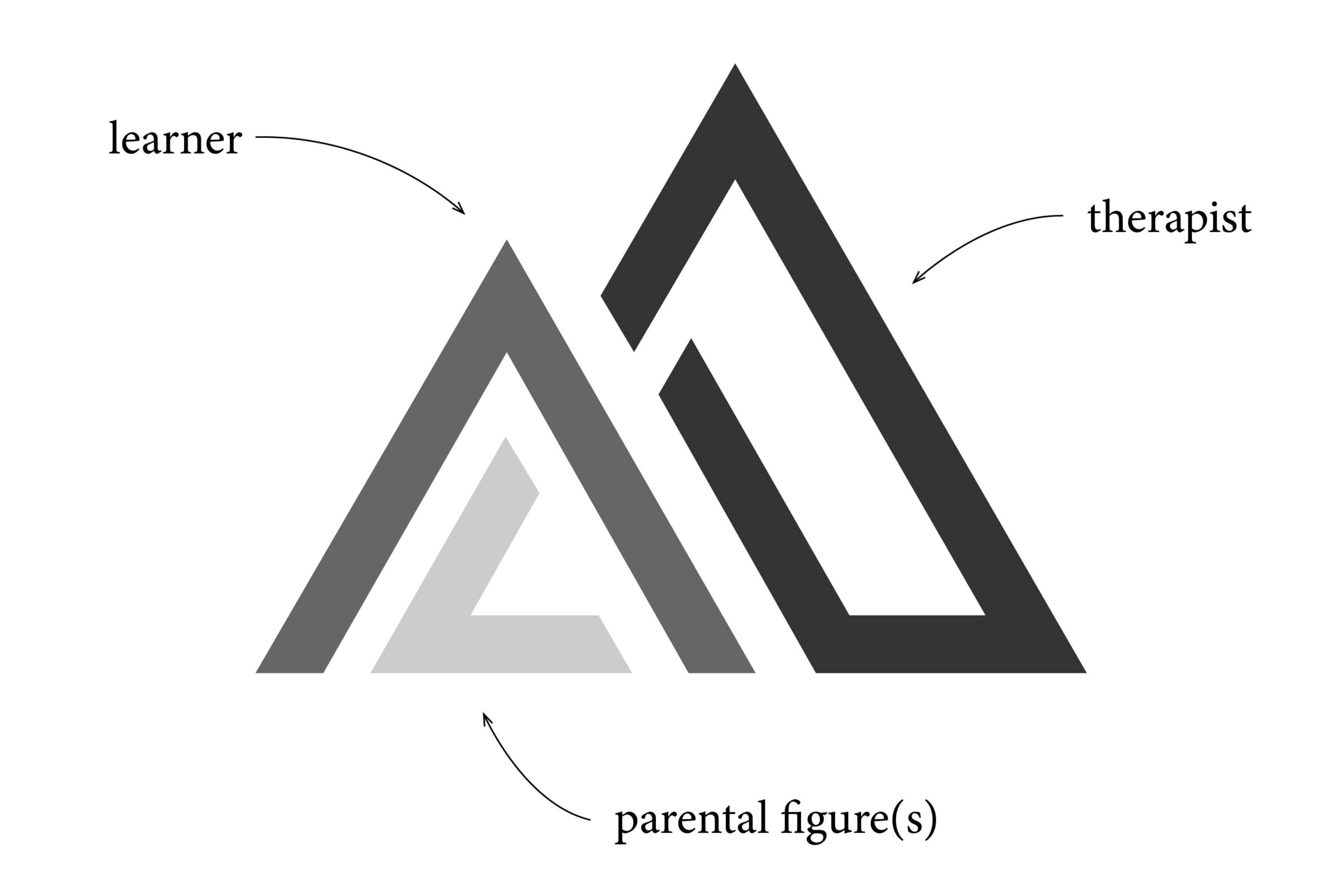
The logo mark was designed in three sections to show how, when supported by their parental figure(s) and their therapist, a learner can build a strong foundation. The forward movement seen in the shape of the logo mark and the brand gradient evokes a feeling of positive change, which is the ultimate goal of these interactions.
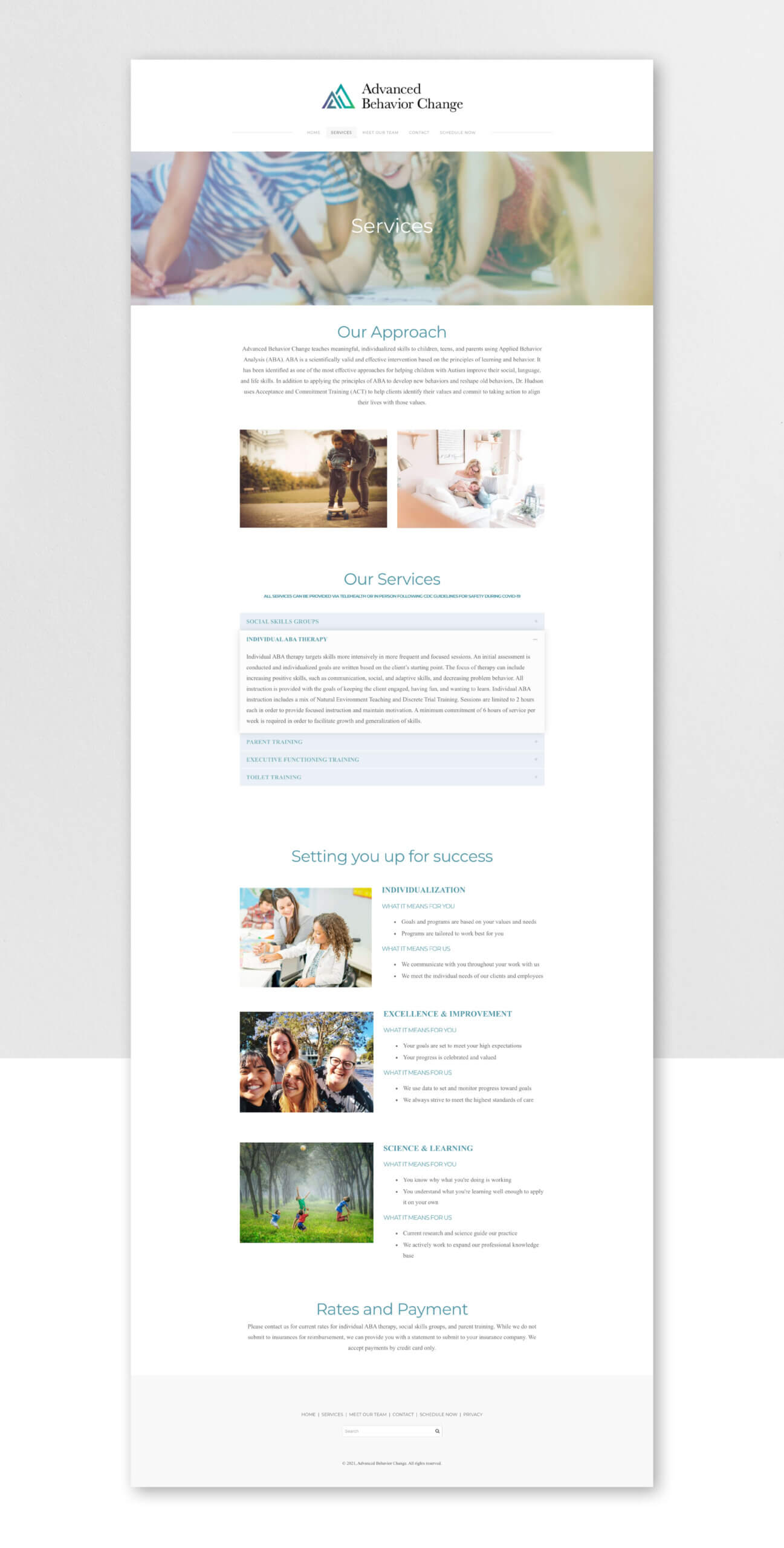
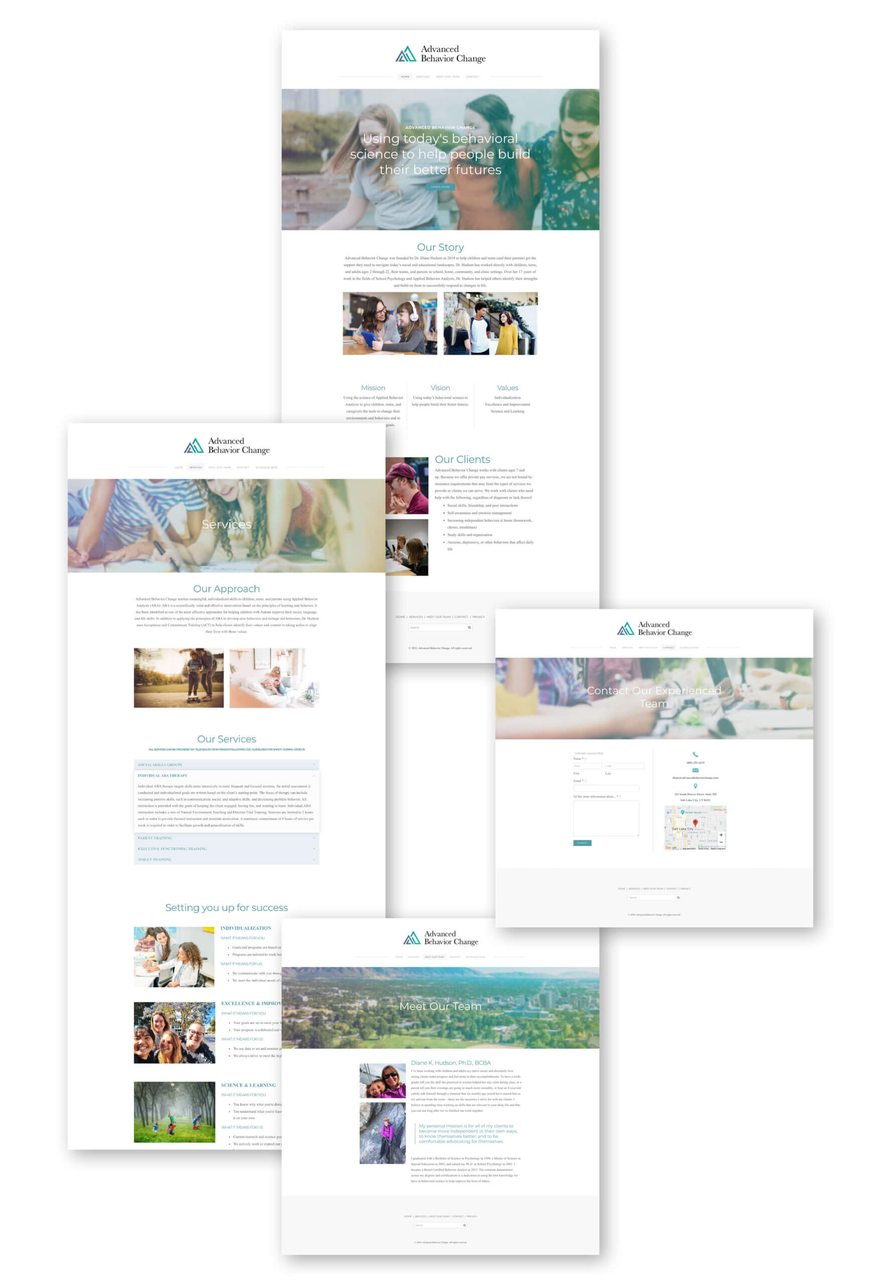
Website
The website was designed in a drag-and-drop editor so that Diane could maintain it herself. A clean and simplified UI set her site (and subsequent updates) up for success.
